I feel immensely grateful for the chance to craft the visual identity of the Mango Mental Health brand. This remarkable group of therapists offers profound support to individuals navigating diverse mental health challenges from a trauma-informed perspective. Given their uplifting impact on the community, it was essential to design an identity that resonates with their positivity.
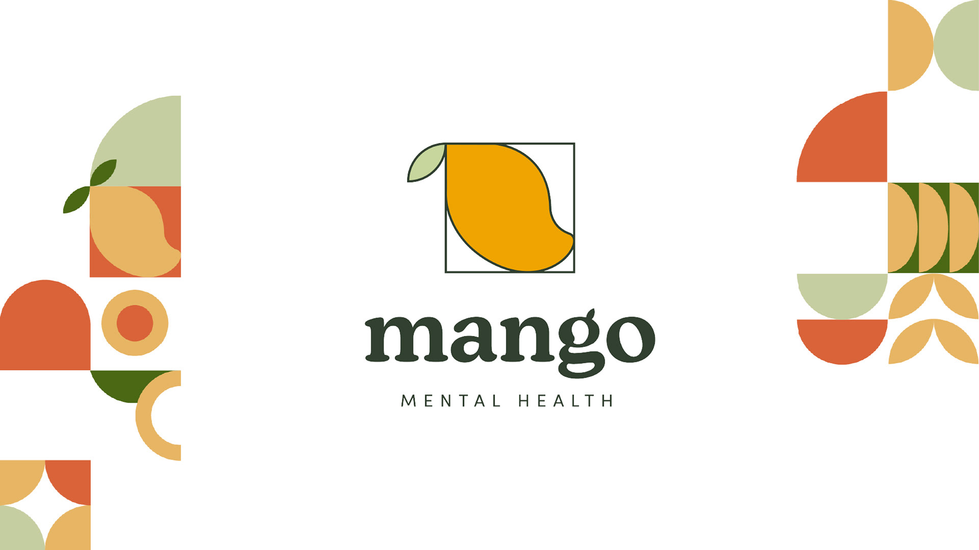
The mango serves as the cornerstone of the logo for profound reasons. Initially selected to honor the founder's Filipino heritage, it embodies cultural roots, emphasizing the significance of understanding one's origins in the path of self-discovery and progression. Furthermore, the mango's lifecycle—from an unripe green fruit to a luscious, golden delight—mirrors the transformative journey individuals undergo through therapy, reshaping thoughts, emotions, and behaviors. Encased within a block, the mango's leaf extends beyond, symbolizing how individuals can “grow”—a visual tale of transcending limitations.
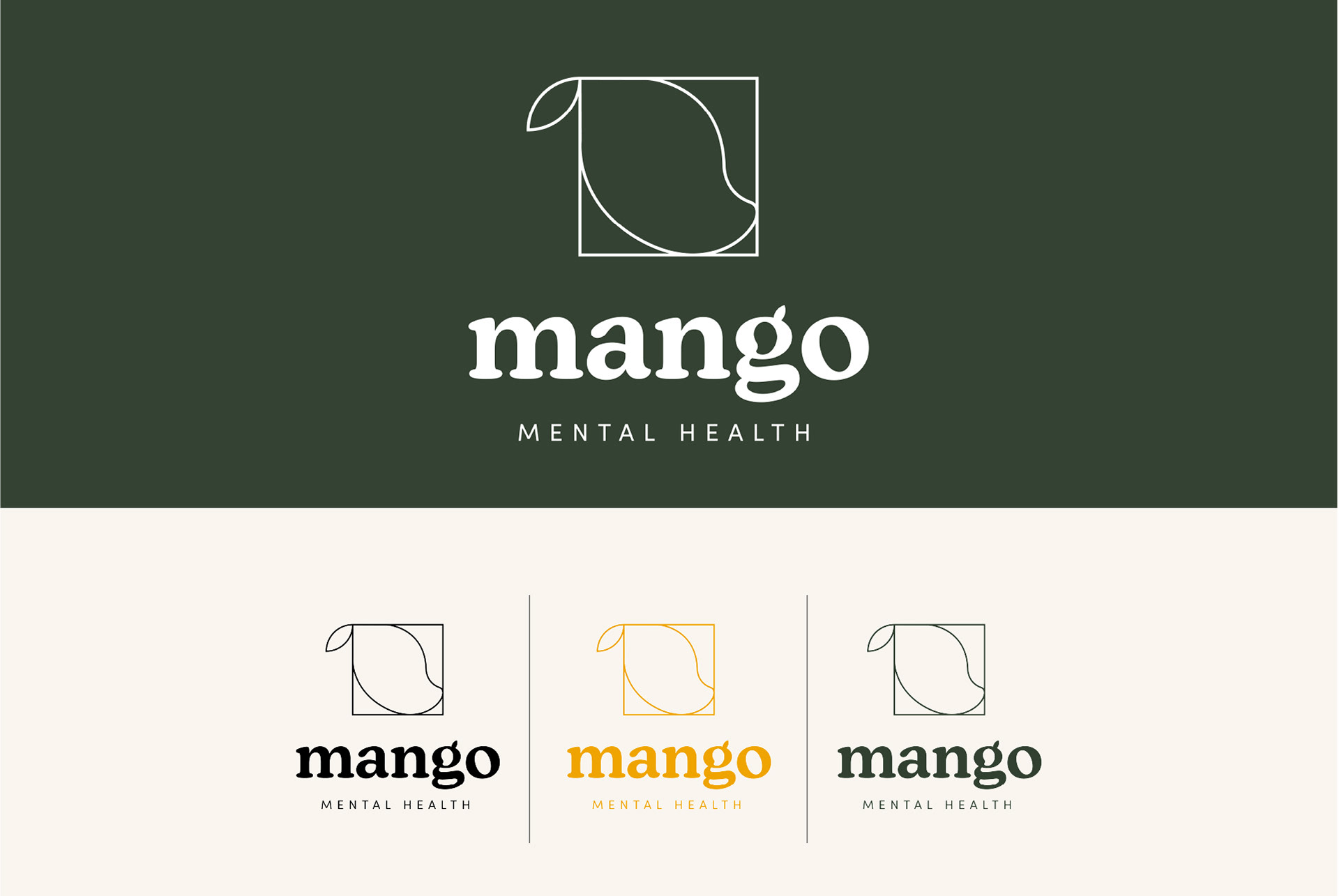
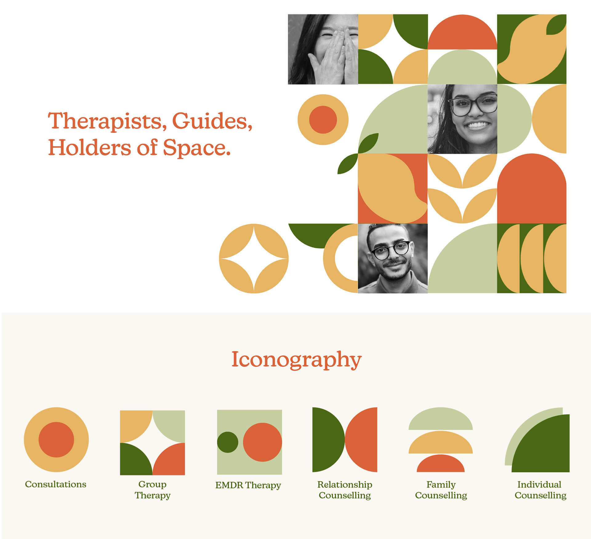
With this concept, I'm aiming to depict the narratives of individuals and their mental health journeys. The design, employing blocks, shapes, colors, and symbols, portrays the diverse range of people and their myriad experiences. It illustrates that despite these differences, each element can seamlessly unite, akin to puzzle pieces forming an array of beautiful patterns.