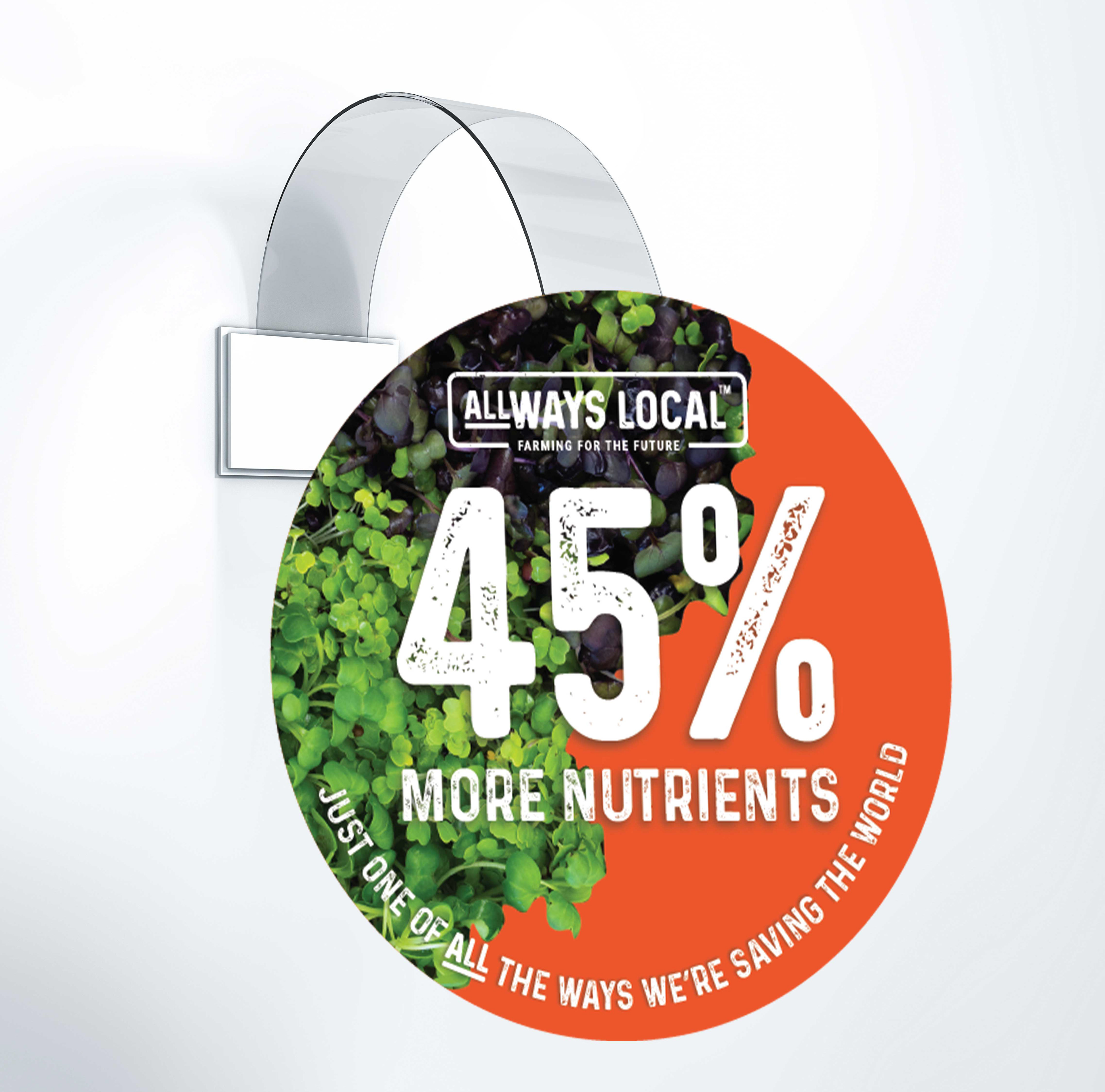
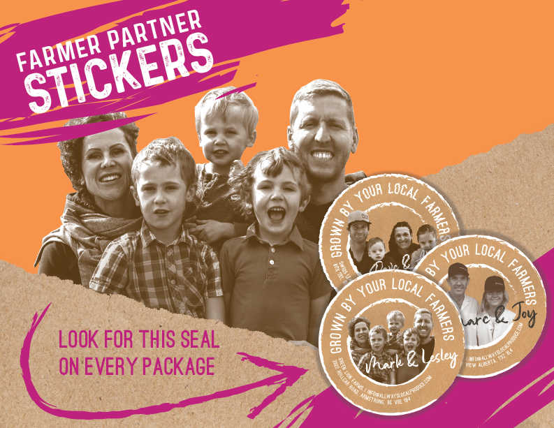
In collaboration with the exceptional team at REX Marketing + Design, I was given the opportunity to design the visual identity of the ALLWays Local brand. ALLWays Local produce are grown local to the communities they cater to. What is unique about them is that they partner with local farmers who grow their produce all year round in Cubic Farm shipping containers. For a company so unique, it needed an identity to match. We wanted to celebrate innovation and bring in vibrant colours that catch the eye.
The design challenge was creating a bright, refreshing brand that still had that rustic, farm-next-door quality.
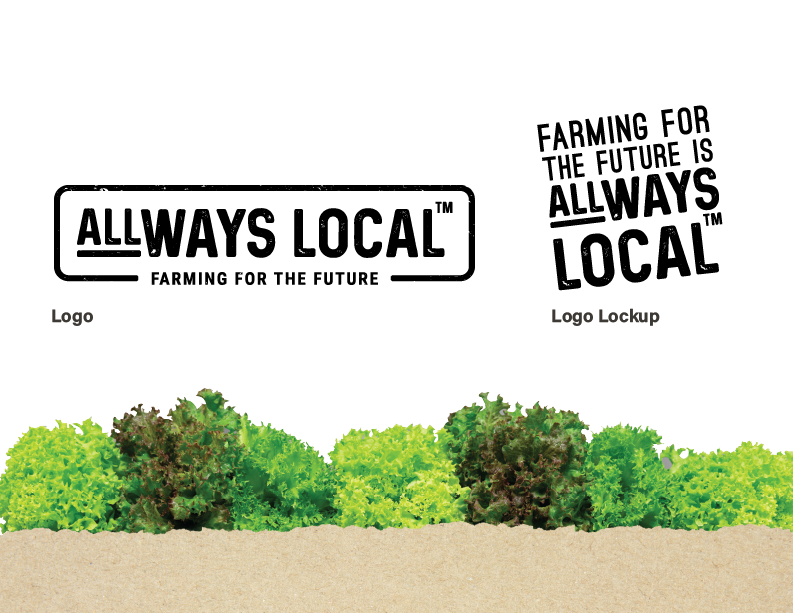

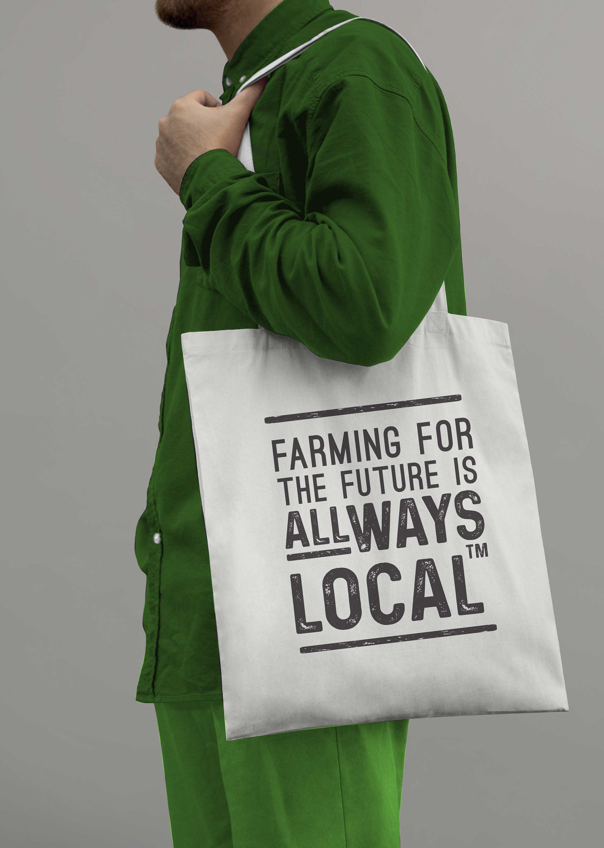
The logo uses a stamp-like font to embody the rustic quality of the brand. The name ALLWays Local is a play on the words 'Always' and All Ways' on the grounds that Allways Local produce is, in fact, local always,
and in all-ways. The rectangle around the name is a nod to the integral Cubic Farms shipping
containers that the farmers use to produce all of their produce year round.
We were thrilled to receive a Summit Creative Award for this logo design.
and in all-ways. The rectangle around the name is a nod to the integral Cubic Farms shipping
containers that the farmers use to produce all of their produce year round.
We were thrilled to receive a Summit Creative Award for this logo design.
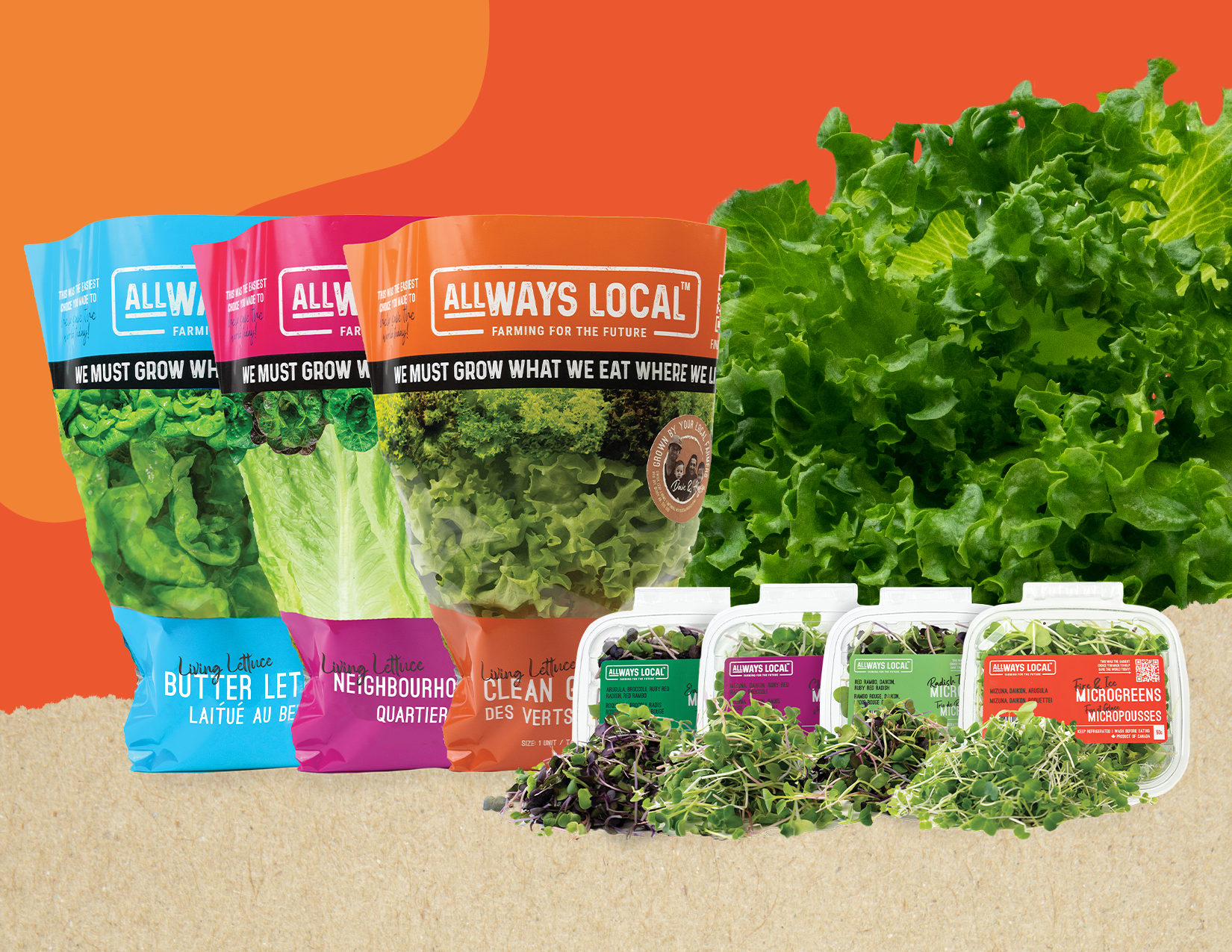
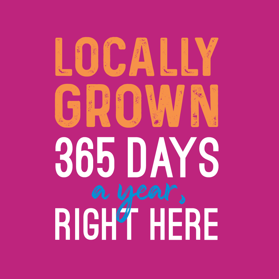
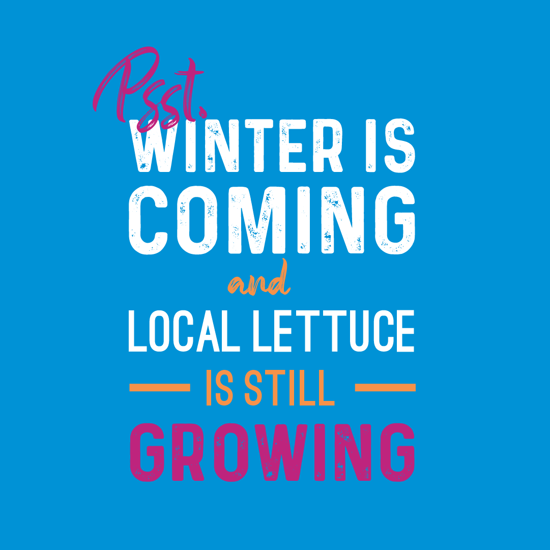
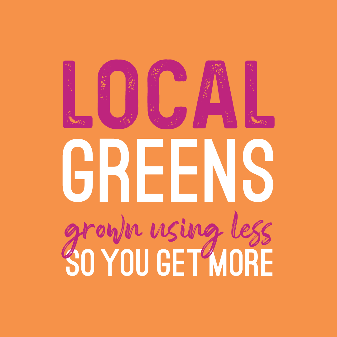
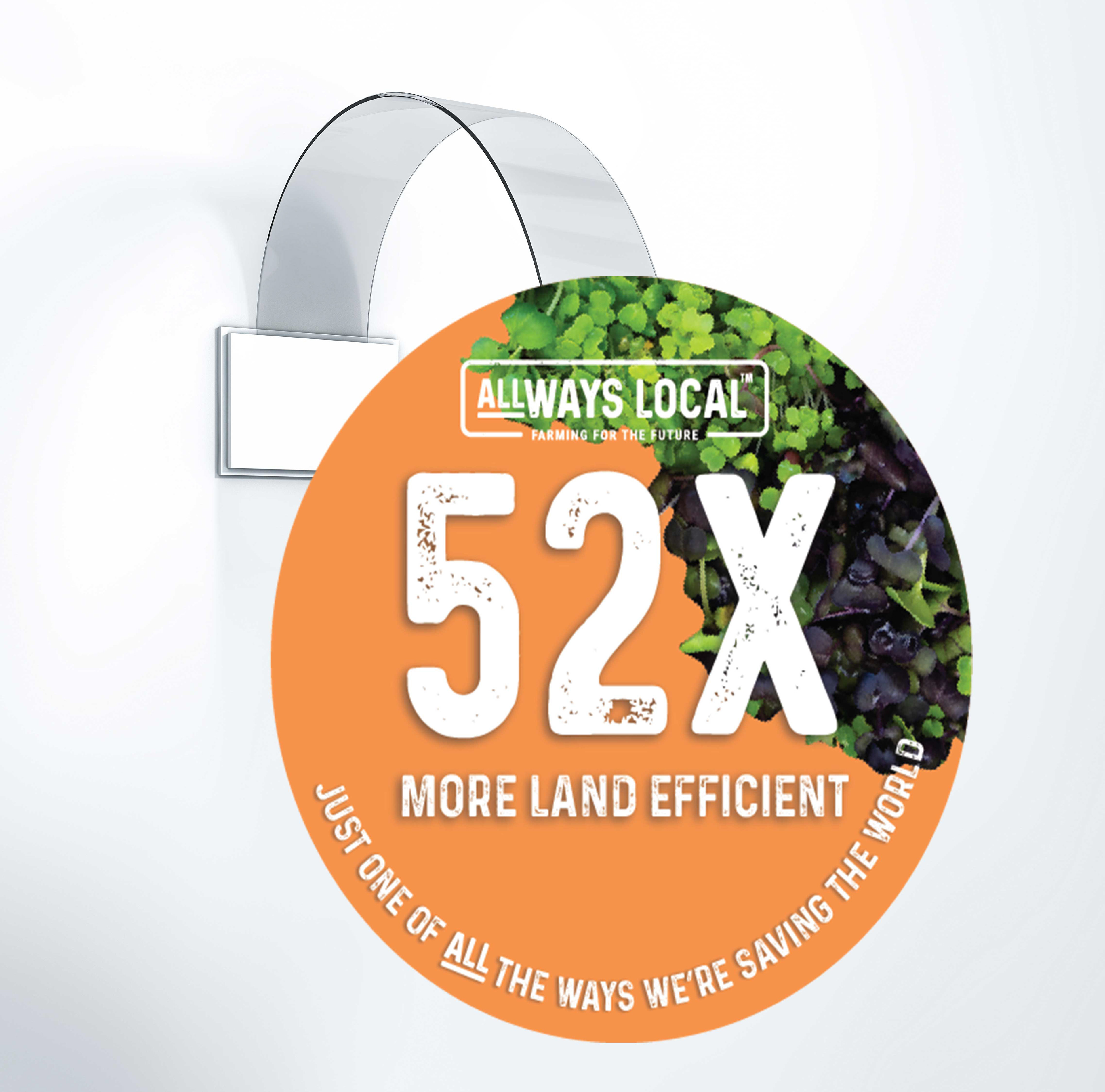
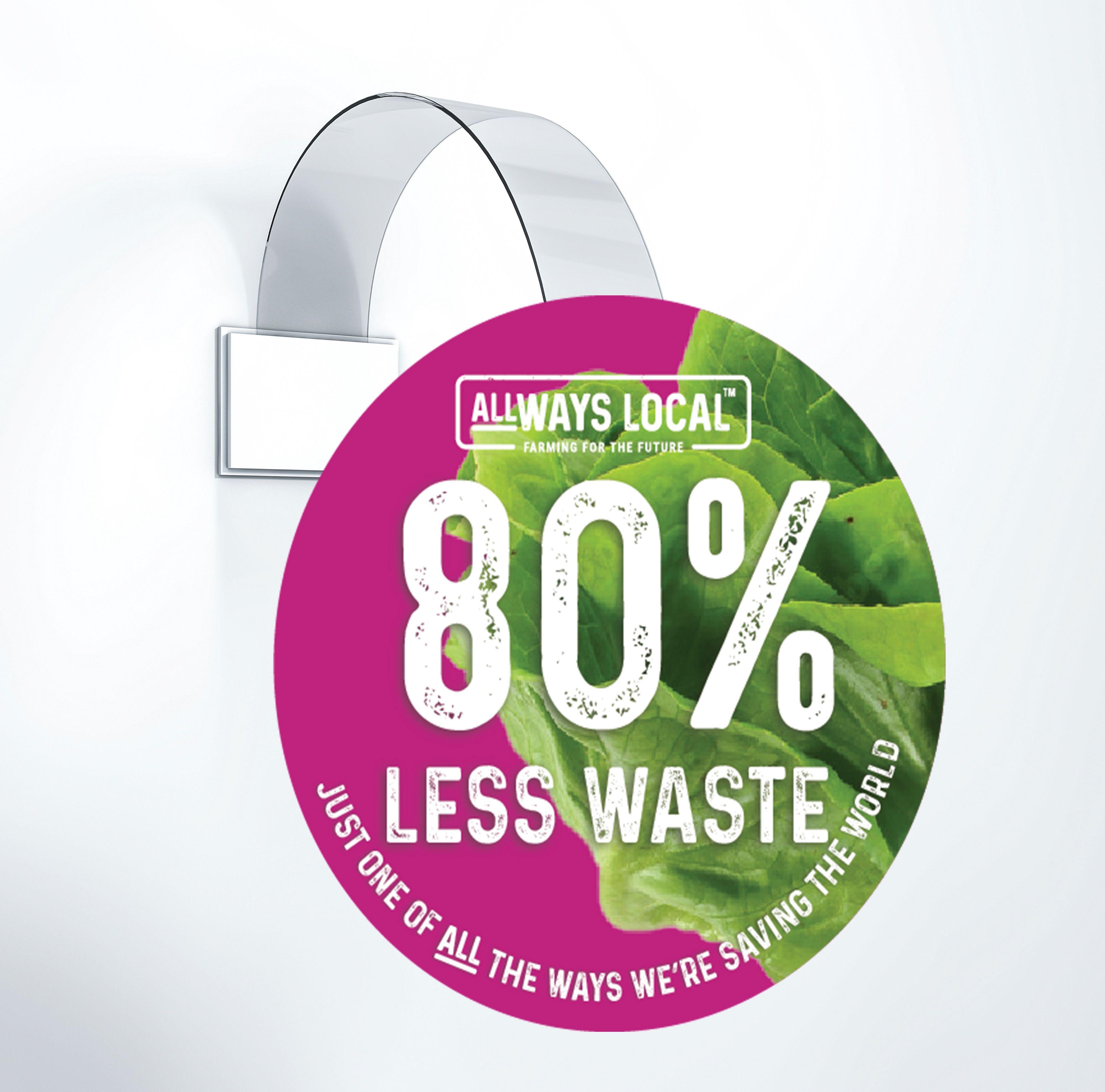
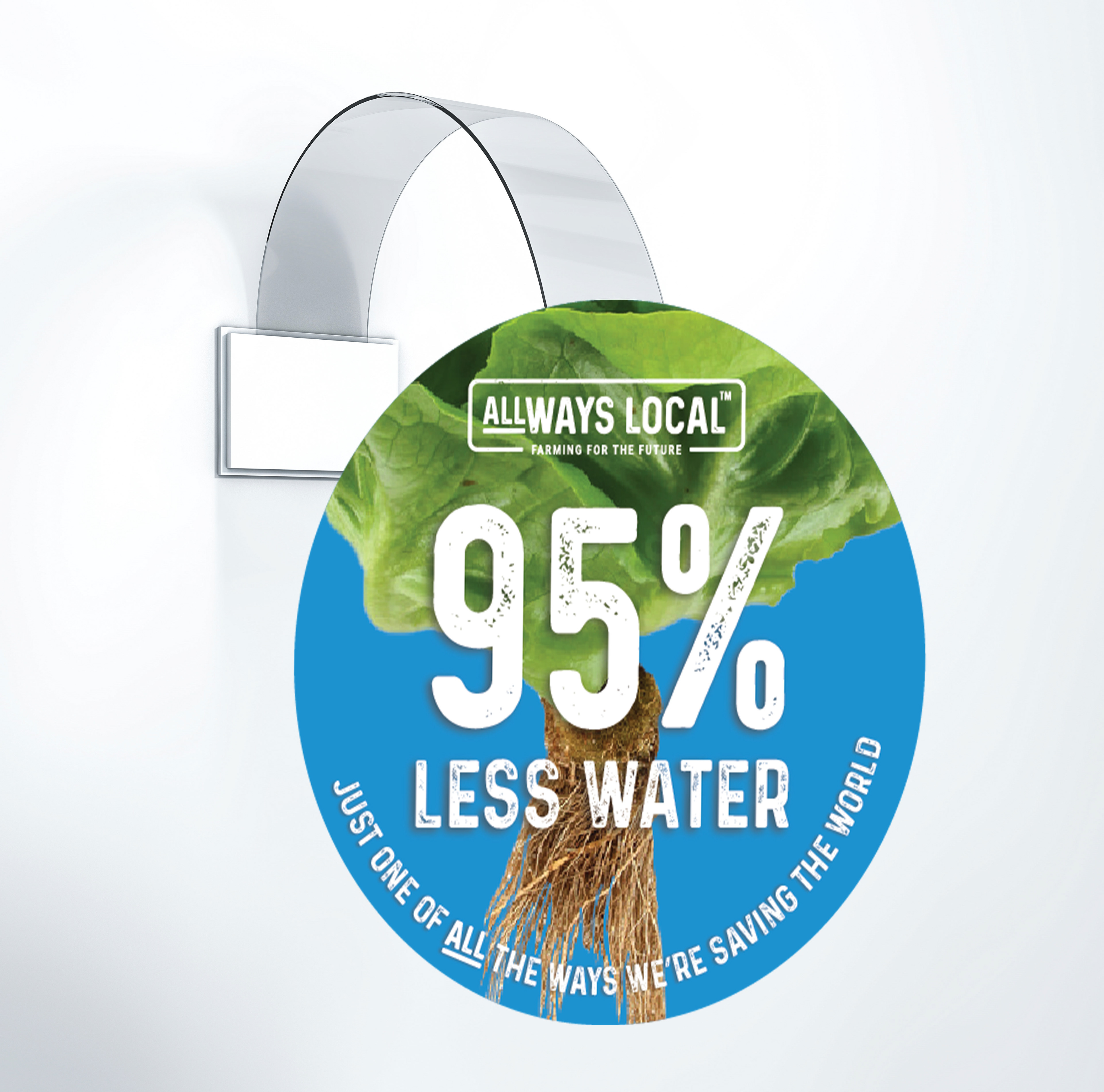
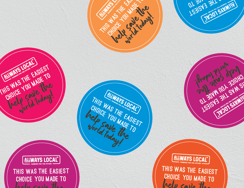
One thing I always wanted to emphasize in the design was the blend of bright, vibrant colours and rustic textures. The goal was to create a brand that felt farm-to-store while still being modern, fun, and bold. We wanted to make an impact, and I think this brand achieves that beautifully.

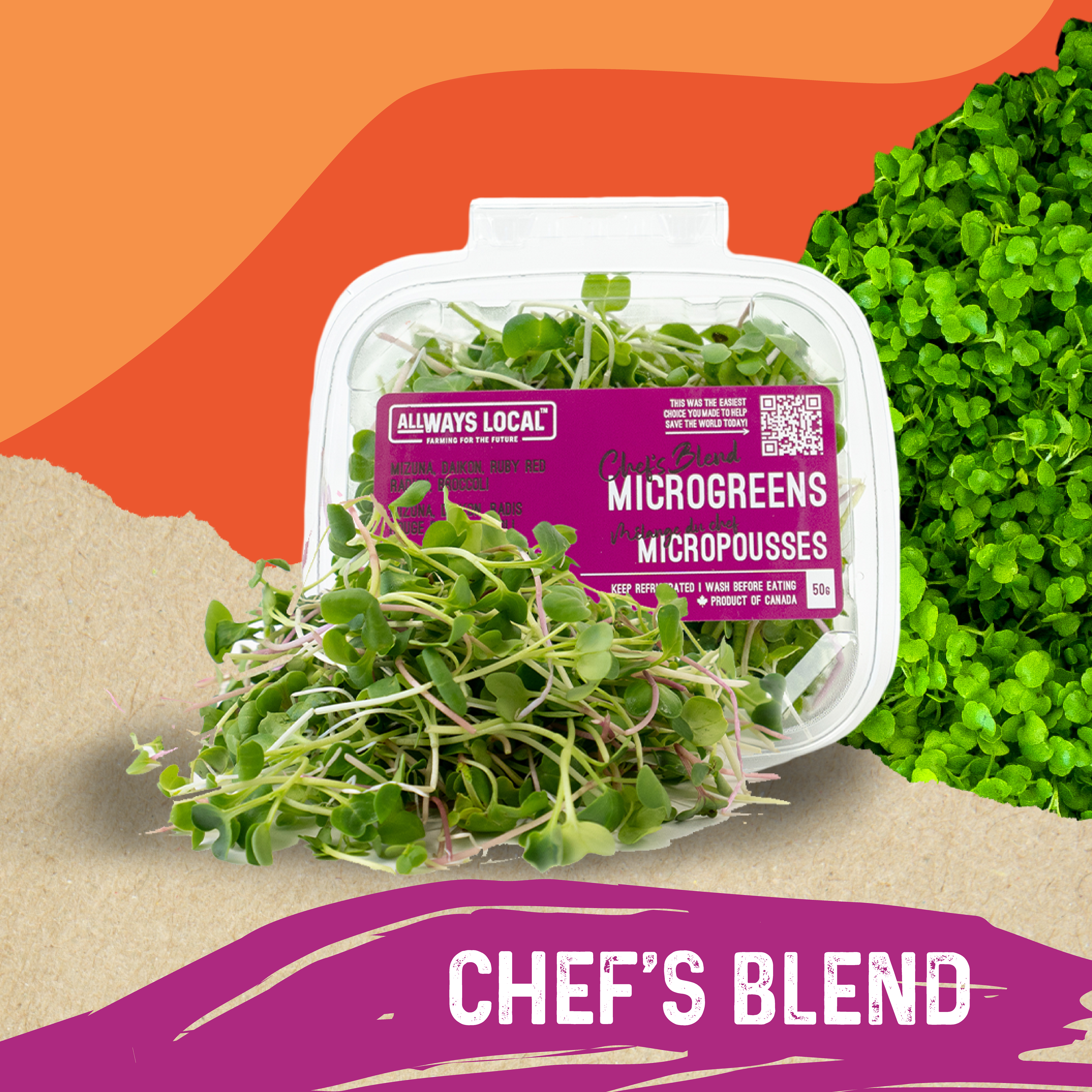
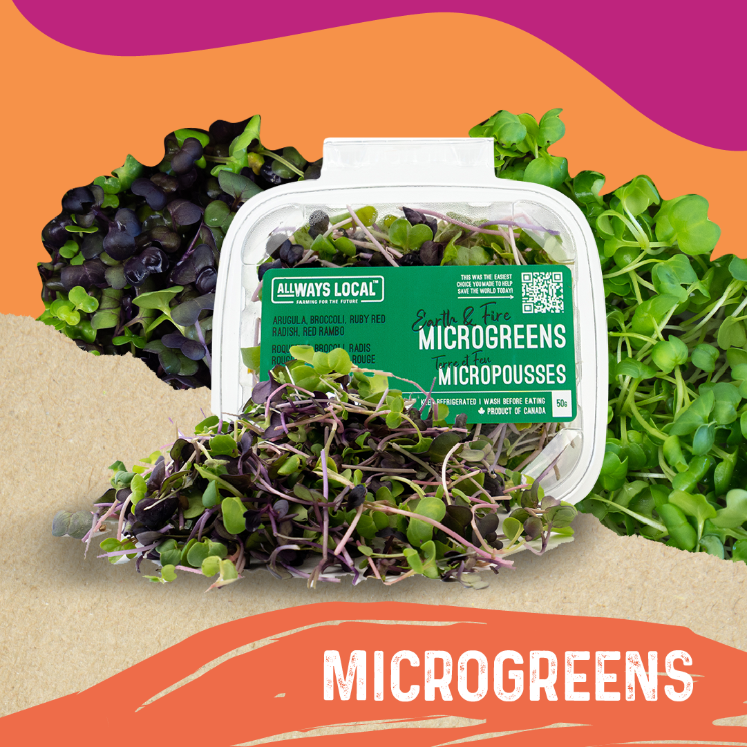

An integral part of the visual identity for ALLWays Local is the creative use of typography to educate the reader about the what makes ALLWays Local exceptional.