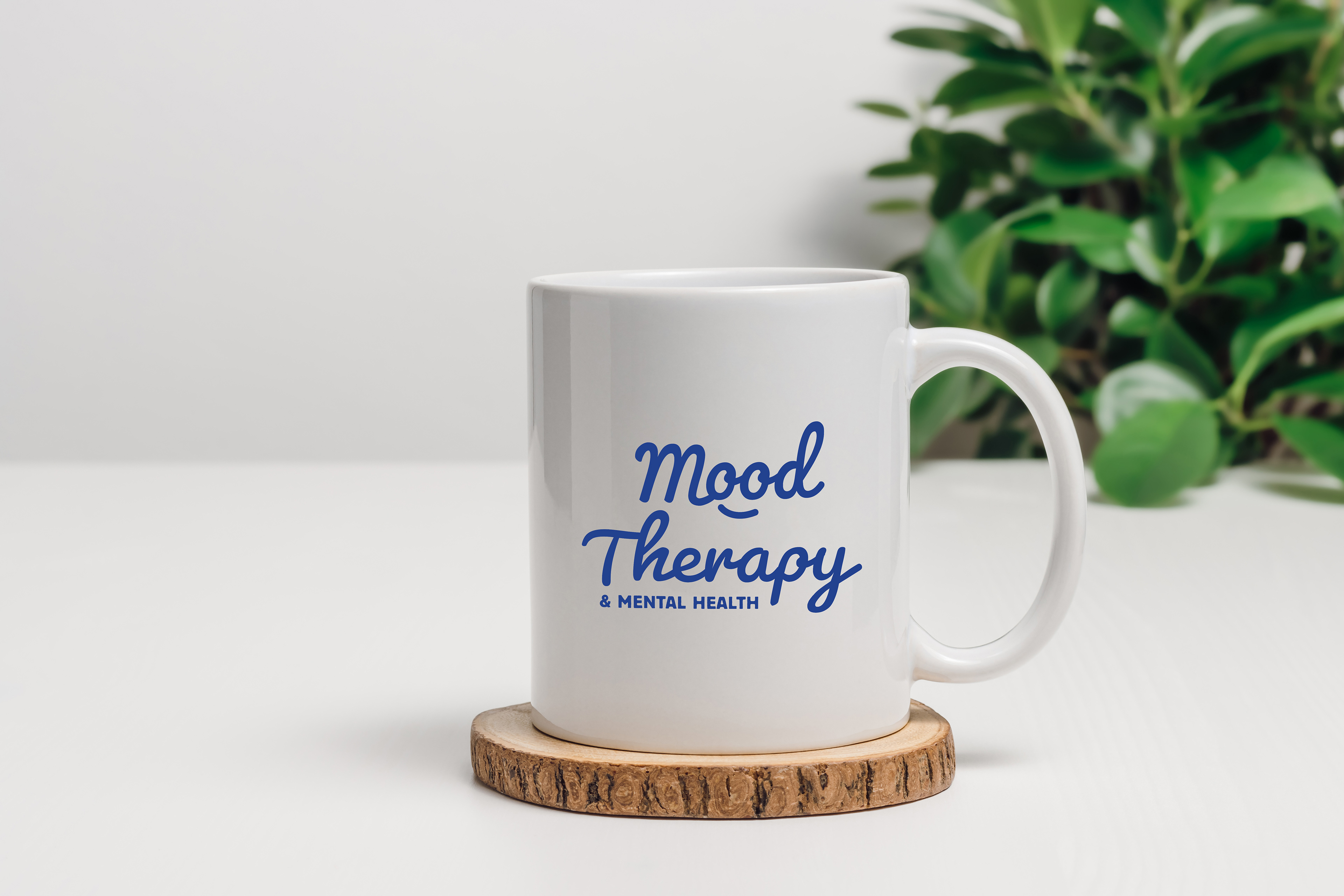
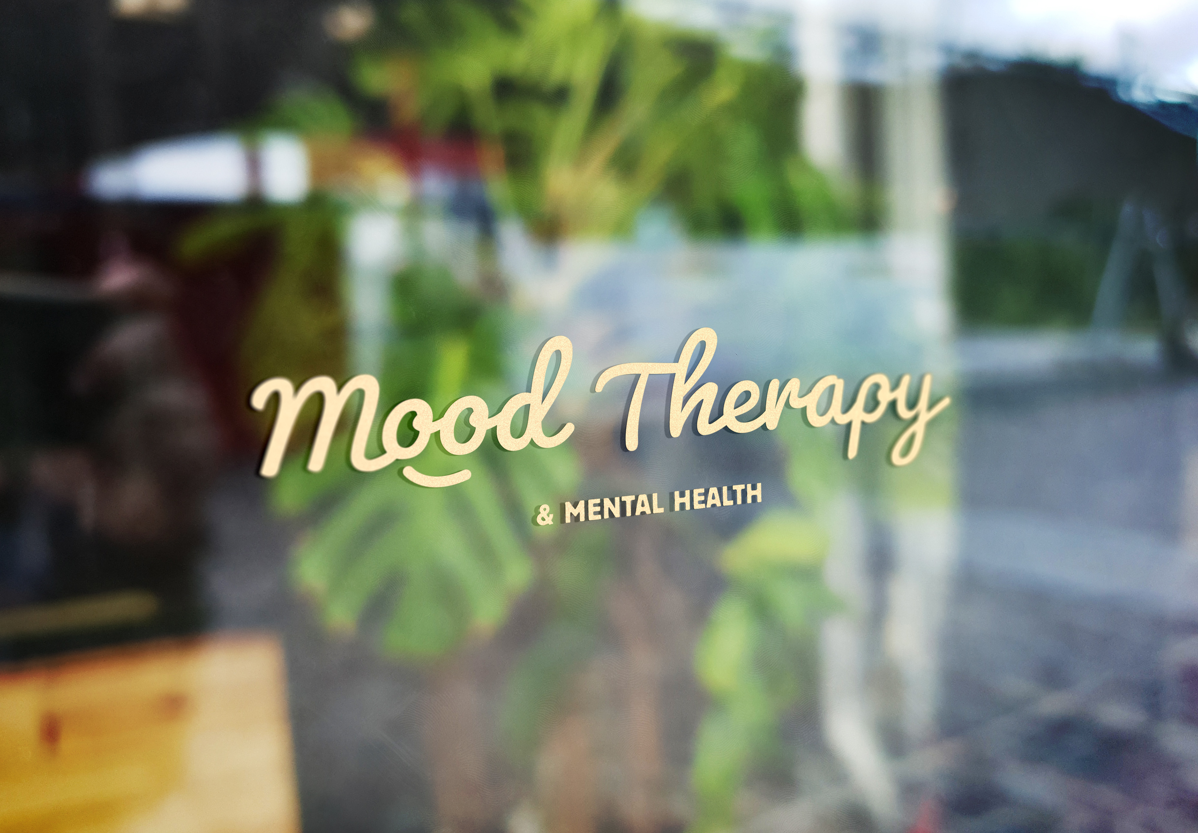
I feel grateful to have had the opportunity to create the visual identity for Mood Therapy. From the outset, the goal was to design a brand that reflected the practice's belief that every emotion has value. Rather than positioning certain moods as "good" or "bad," the identity embraces the full range of human experience, creating a visual language that feels approachable, supportive, and deeply human. This was so much fun to make.
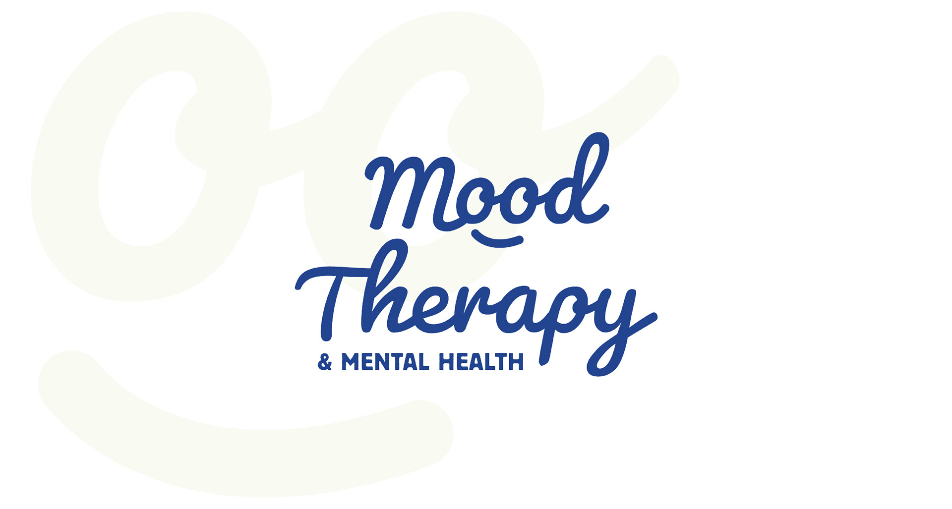
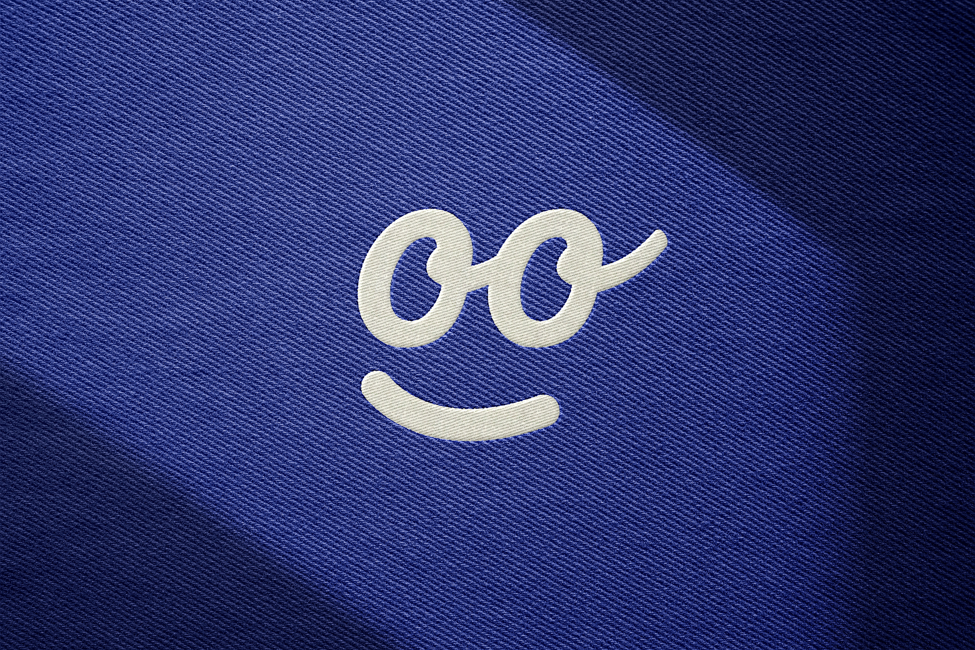
The logo for Mood Therapy uses the two “O”s in the word “Mood” to form a subtle, minimalist face. In it’s Icon form (see page 4), it is able to be seen as either smiling or sad. This duality captures the philosophy that all moods are valid, and emotional expression, whether joyful or heavy, is part of being human. To that point, the logo design for Mood embraces the idea that being “moody” isn’t a bad thing.
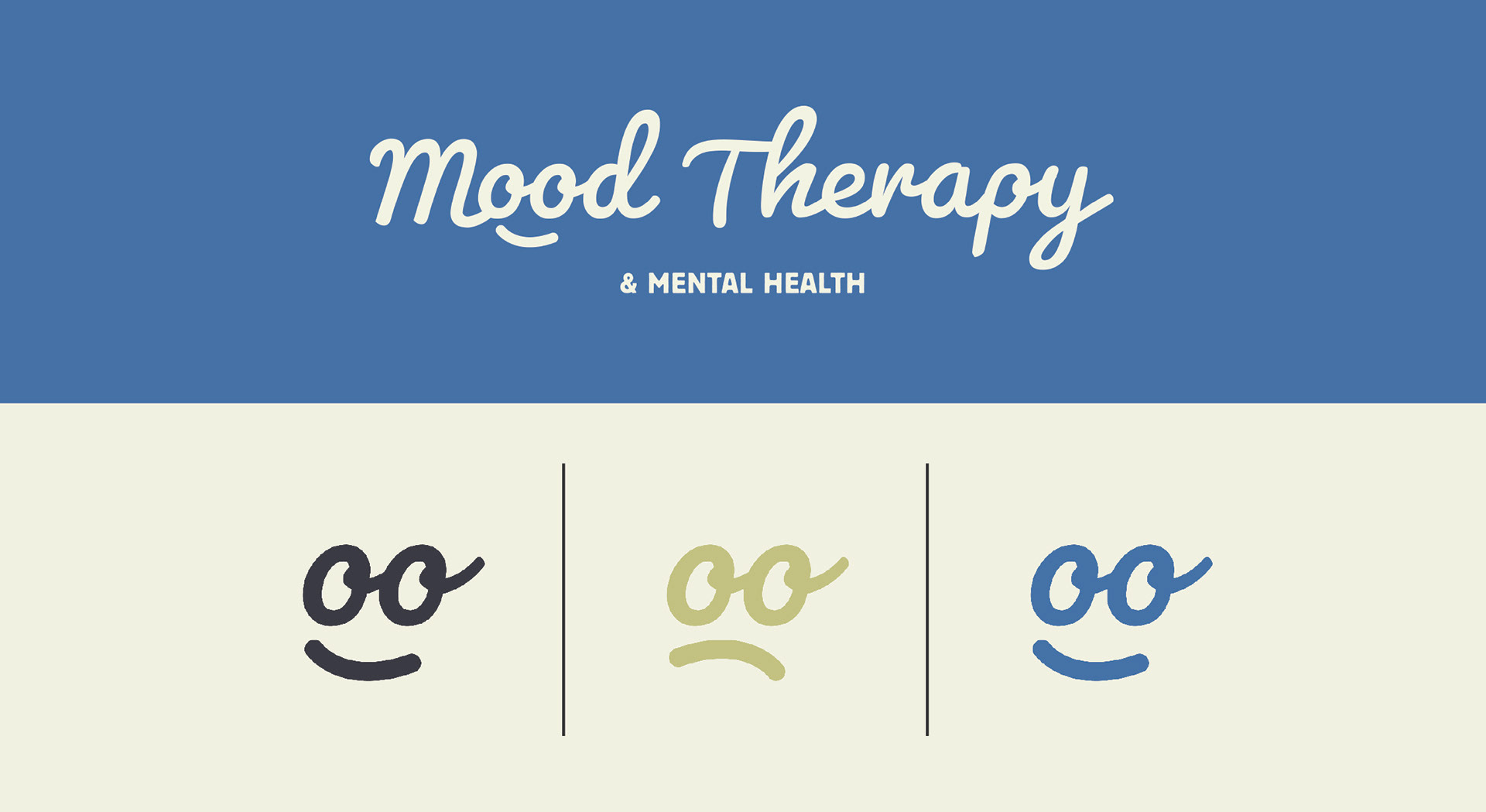
The two “O”s in the word “Mood” to form a subtle, minimalist face that is able to be presented as either smiling or sad.