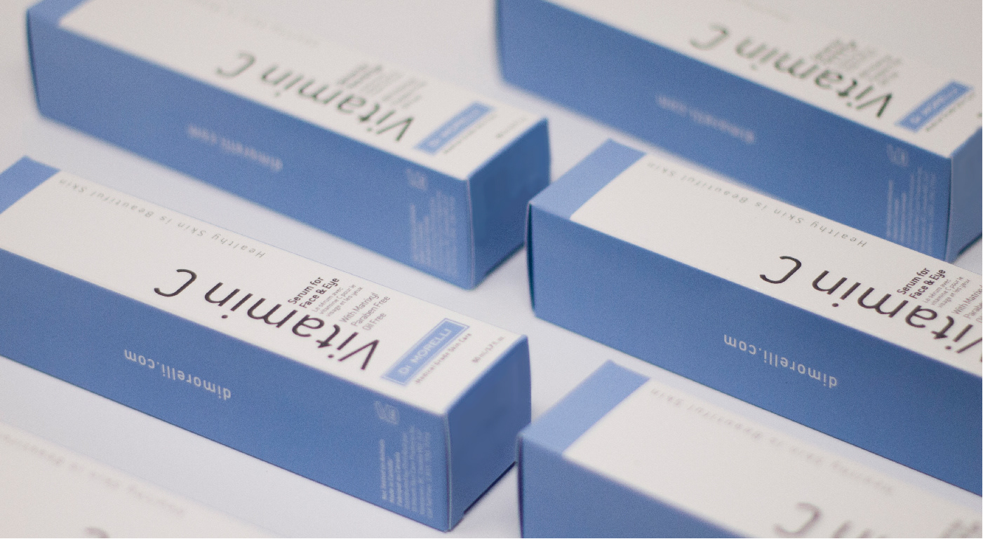
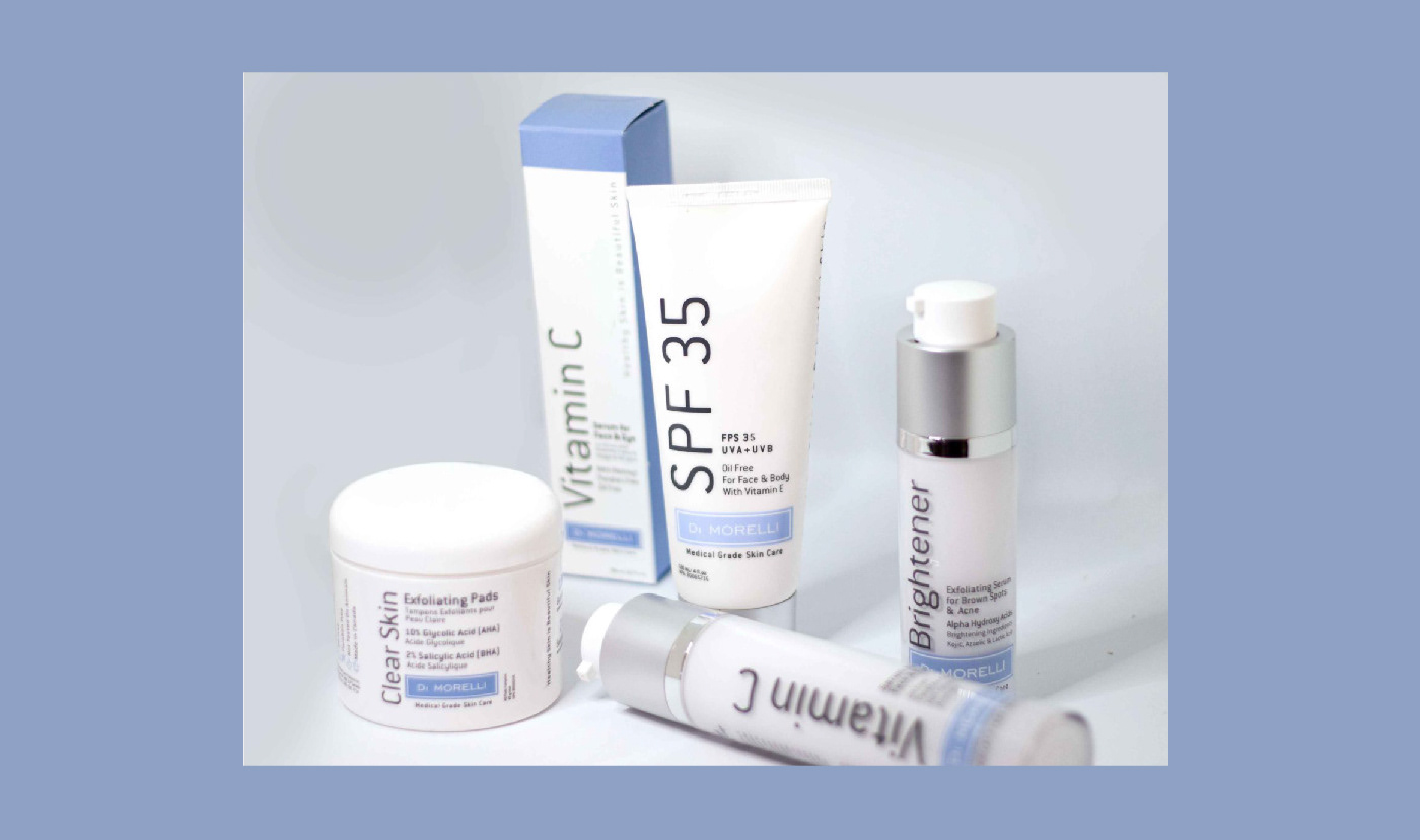
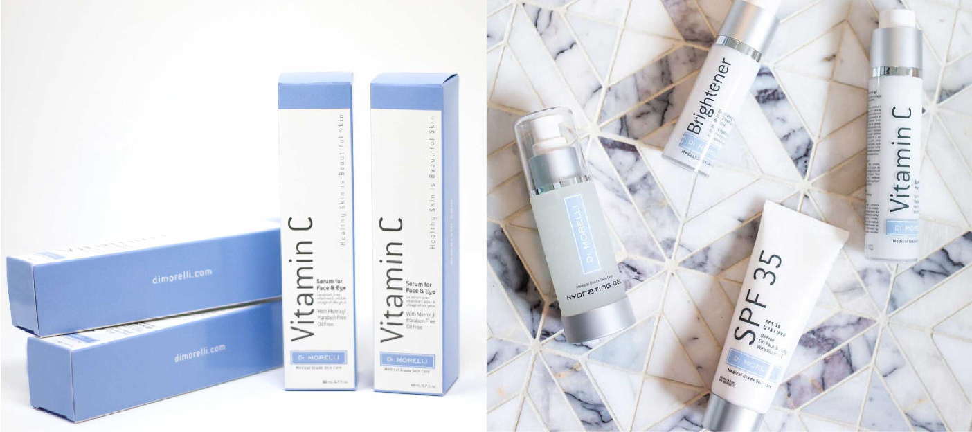
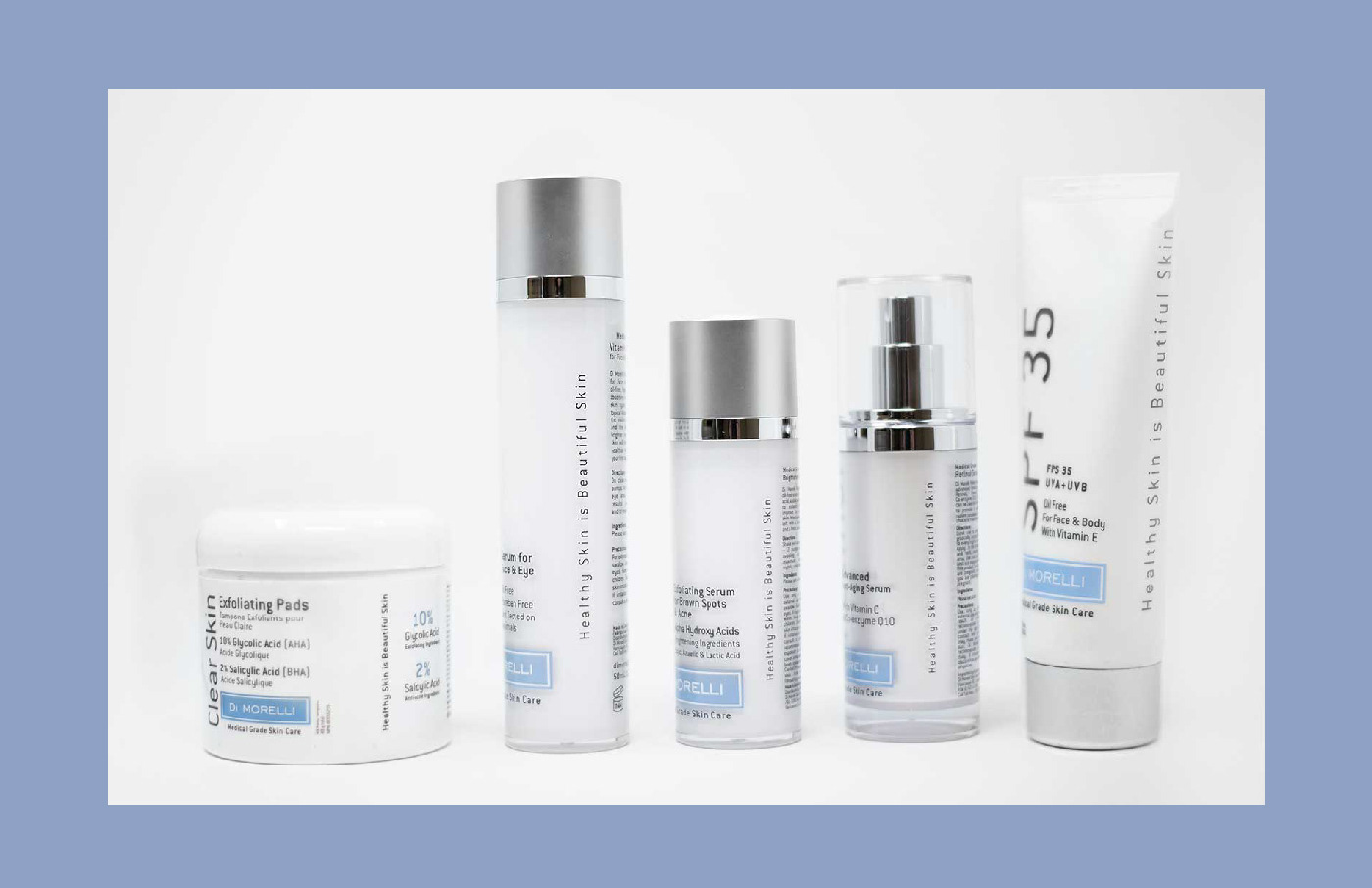
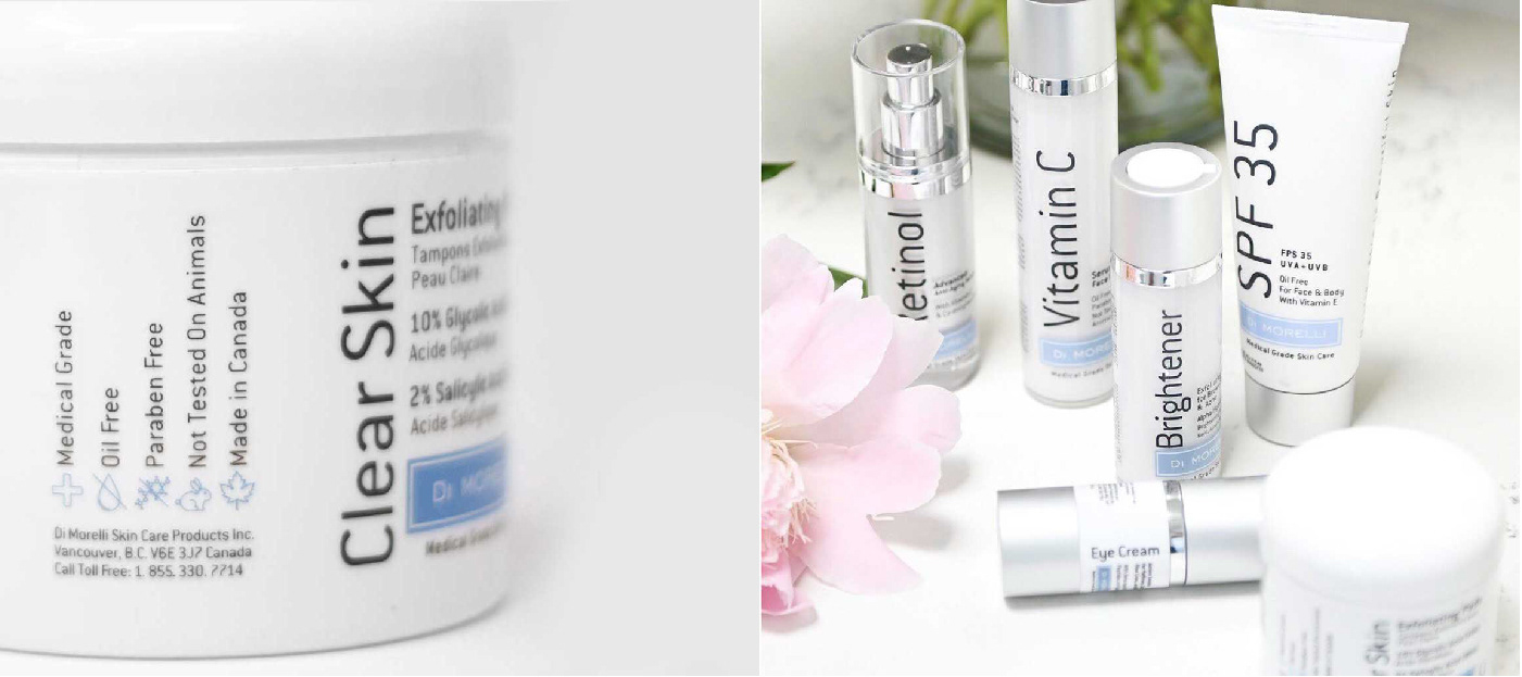
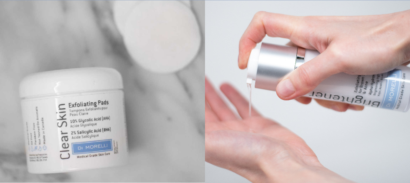
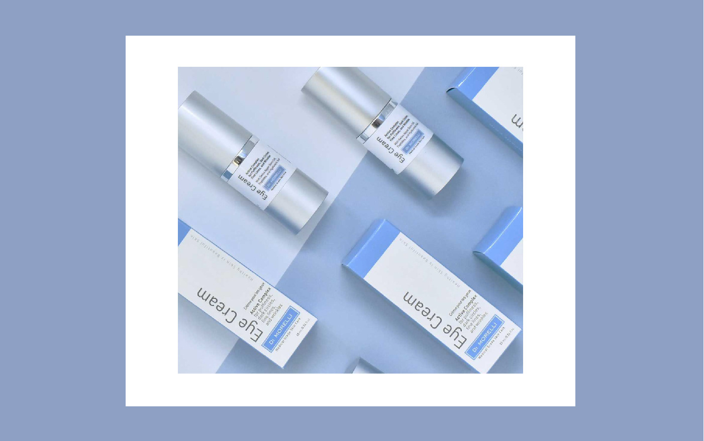
Di Morelli Skin Care is a line of high quality, medical grade skin care products founded in 2008 by Vancouver based physician Dr. Robert Morrell. The intention of the new packaging design is to distinguish itself from its competitors on the shelves. The design needed to be elegant and needed to stand out, so to accomplished this we emphasized the medical grade ingredients that the products use.
Here’s an example of what the old bottle design looked like (there are also some newer bottles shown throughout the display).
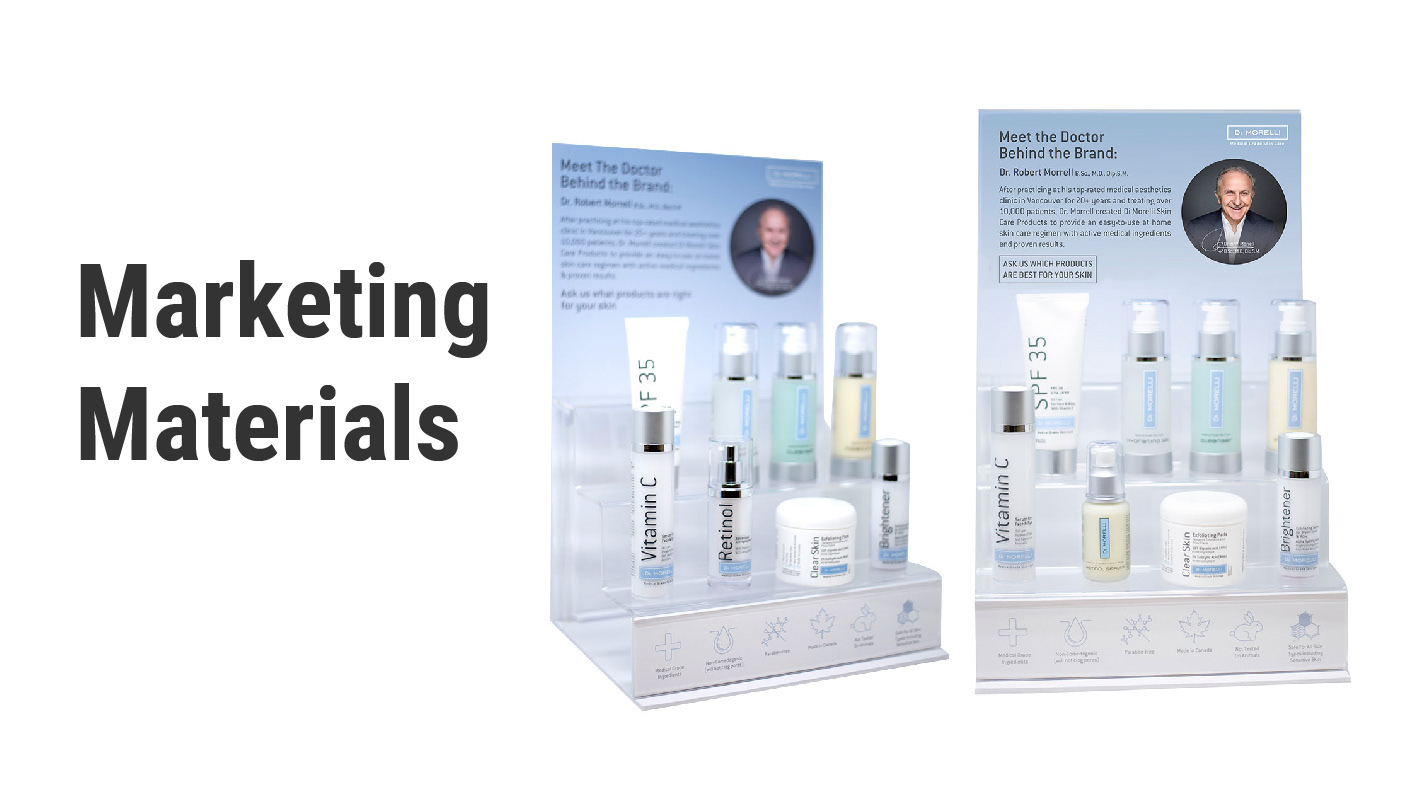
At the beginning of this project, the challenge was finding a way to effectively showcase the products on retail countertops when all we had available was the acrylic stand and the products themselves. To help the display stand out more, I designed a printed foam backing that included information about the products, as well as details about Dr. Morrell, the founder.
I also created a panel that sat behind the front acrylic step, featuring icons that visually communicated additional product information. This became an elegant way to display the products while conveying information in a clear, concise, and visually engaging manner.
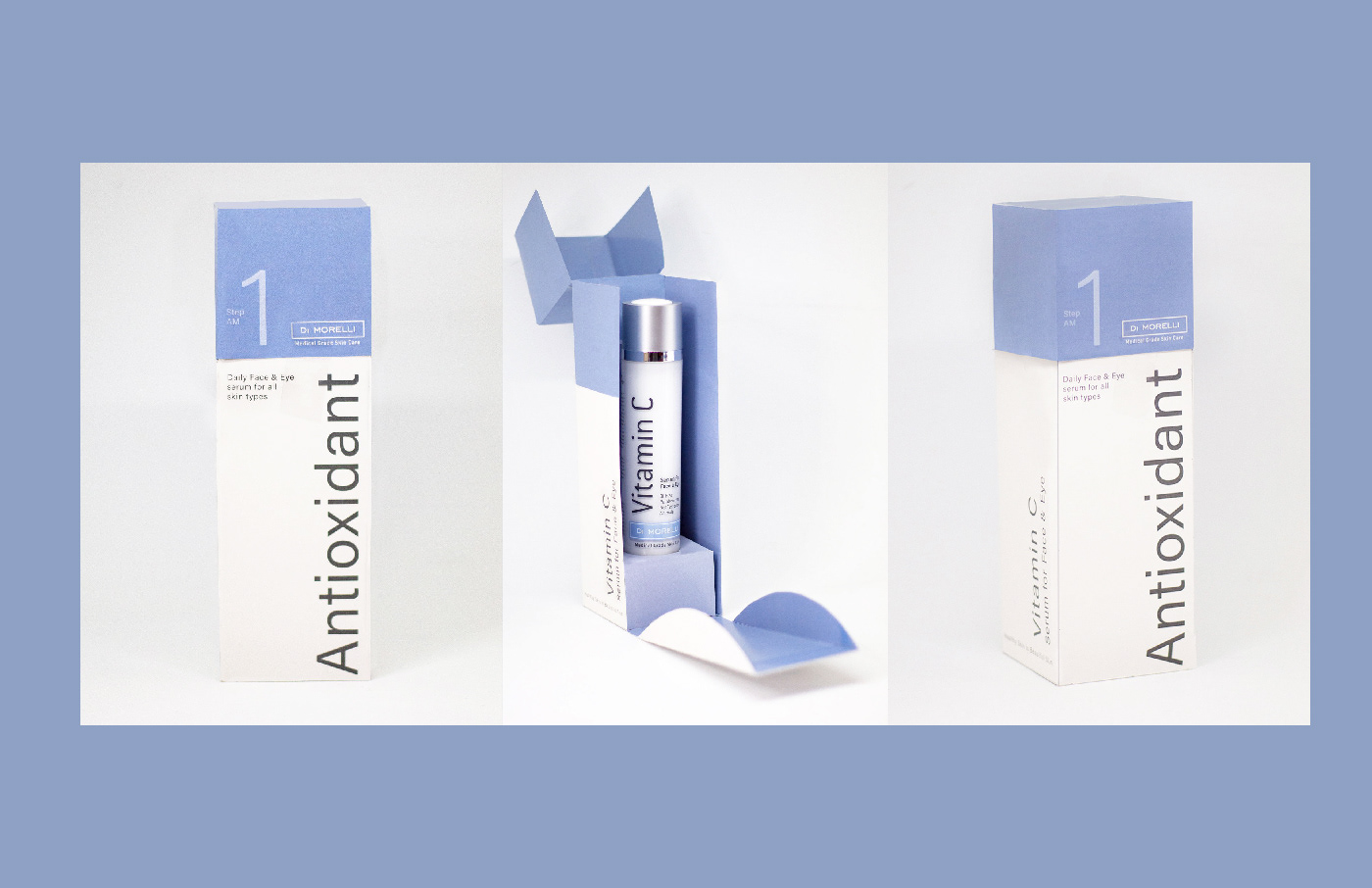
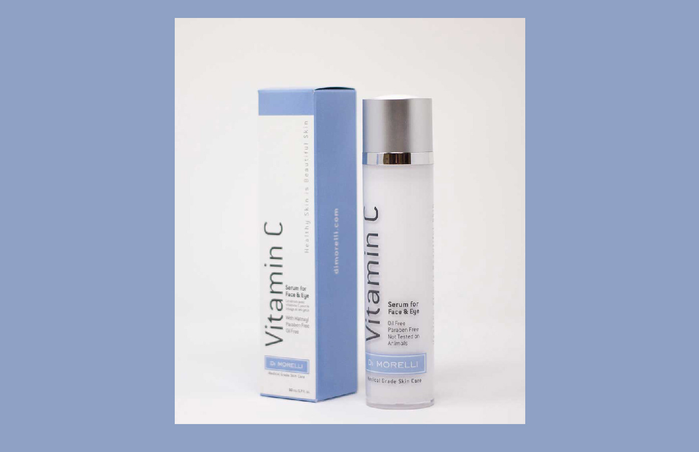
This fun media package was designed as a stand-alone, eye-catching piece for media and VIP clients. The box was created to be shipping-friendly, ensuring the Vitamin C bottle remained secure and wouldn’t shift around during transit.
When opened from the top, the front panel of the box falls down to reveal the Vitamin C bottle inside. This flap also features product information, infographics, and key highlights about the medical-grade ingredients used in the formula.
This project came with a tight timeline for both design and execution, making it a fun and creative challenge to take on with the Di Morelli team.