I had the privilege of designing the visual identity for Carabao Mental Health. The organization was founded by two sisters, one a physician and the other a therapist, who came together to create an umbrella healthcare brand that would unite multiple clinics under one cohesive identity.
I had previously worked with one of the founders on several projects, including the branding for Mango Mental Health, so it was especially meaningful to collaborate with them again on this new venture.
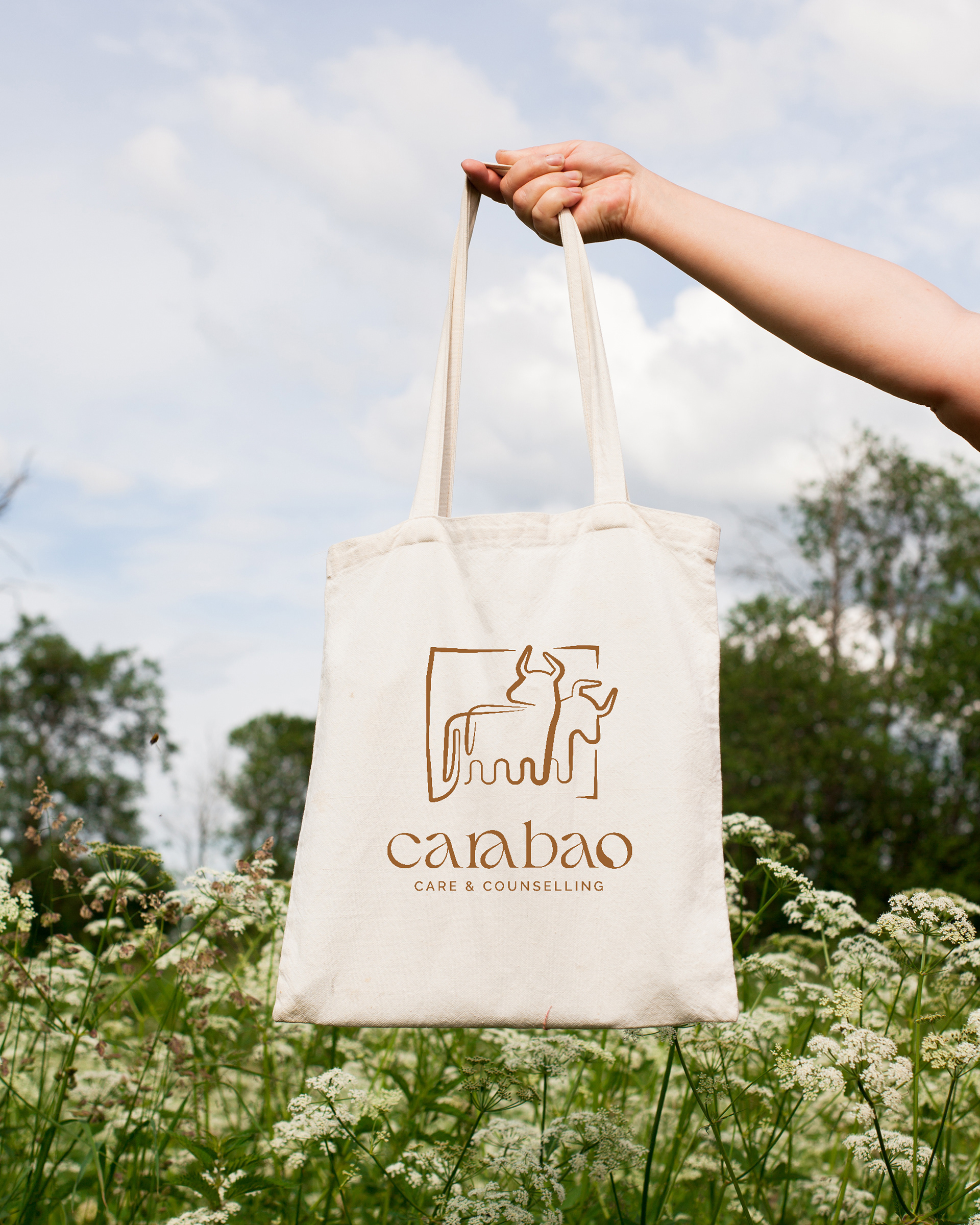
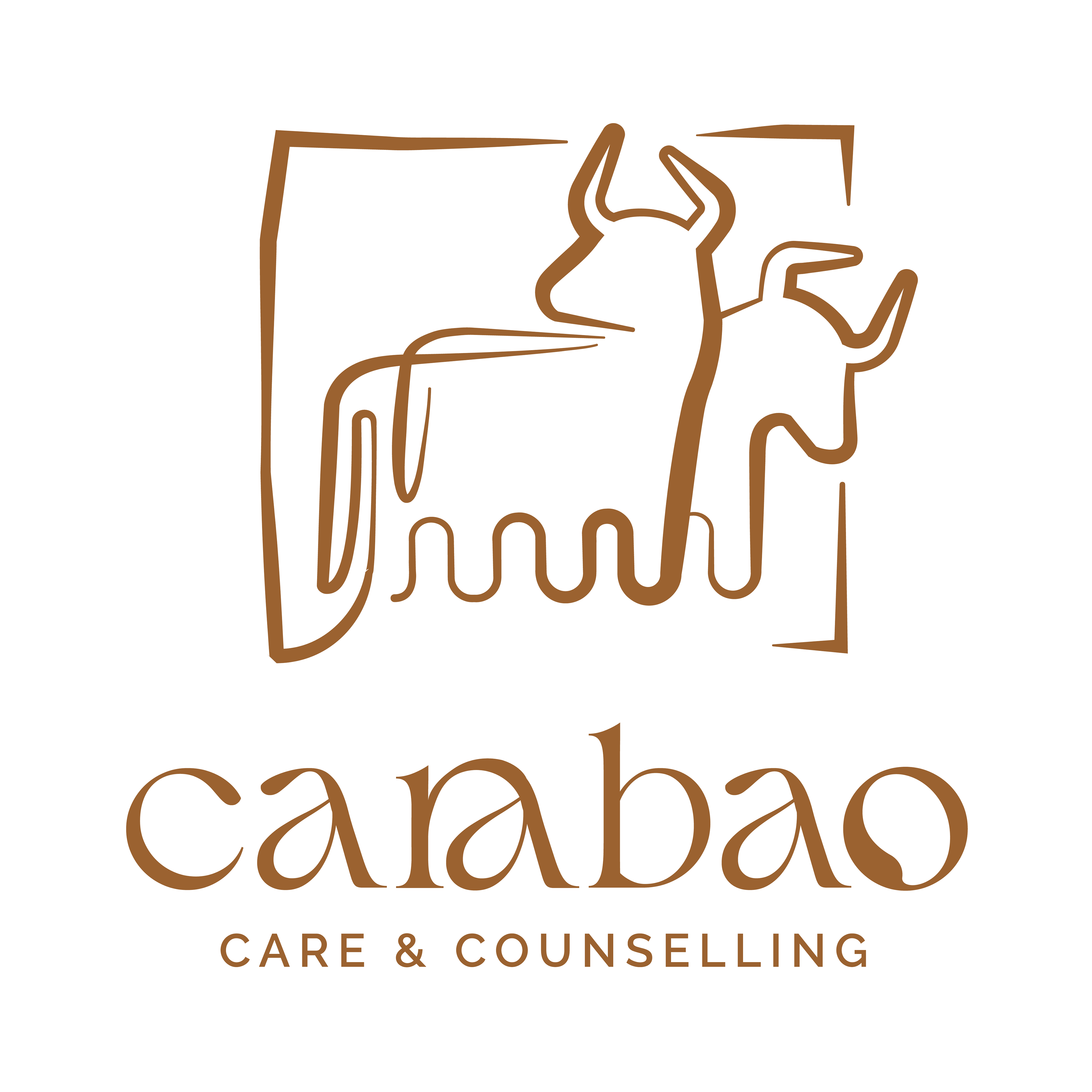
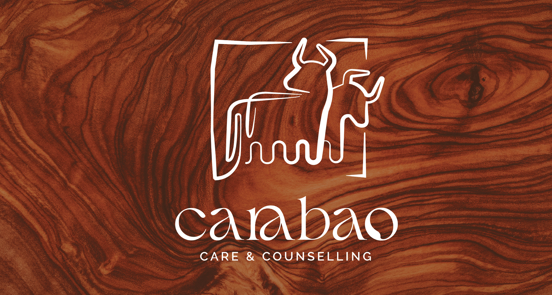
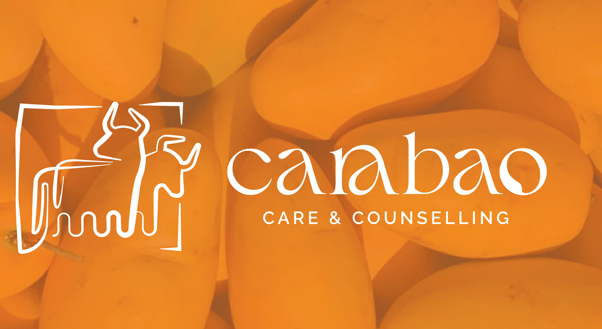
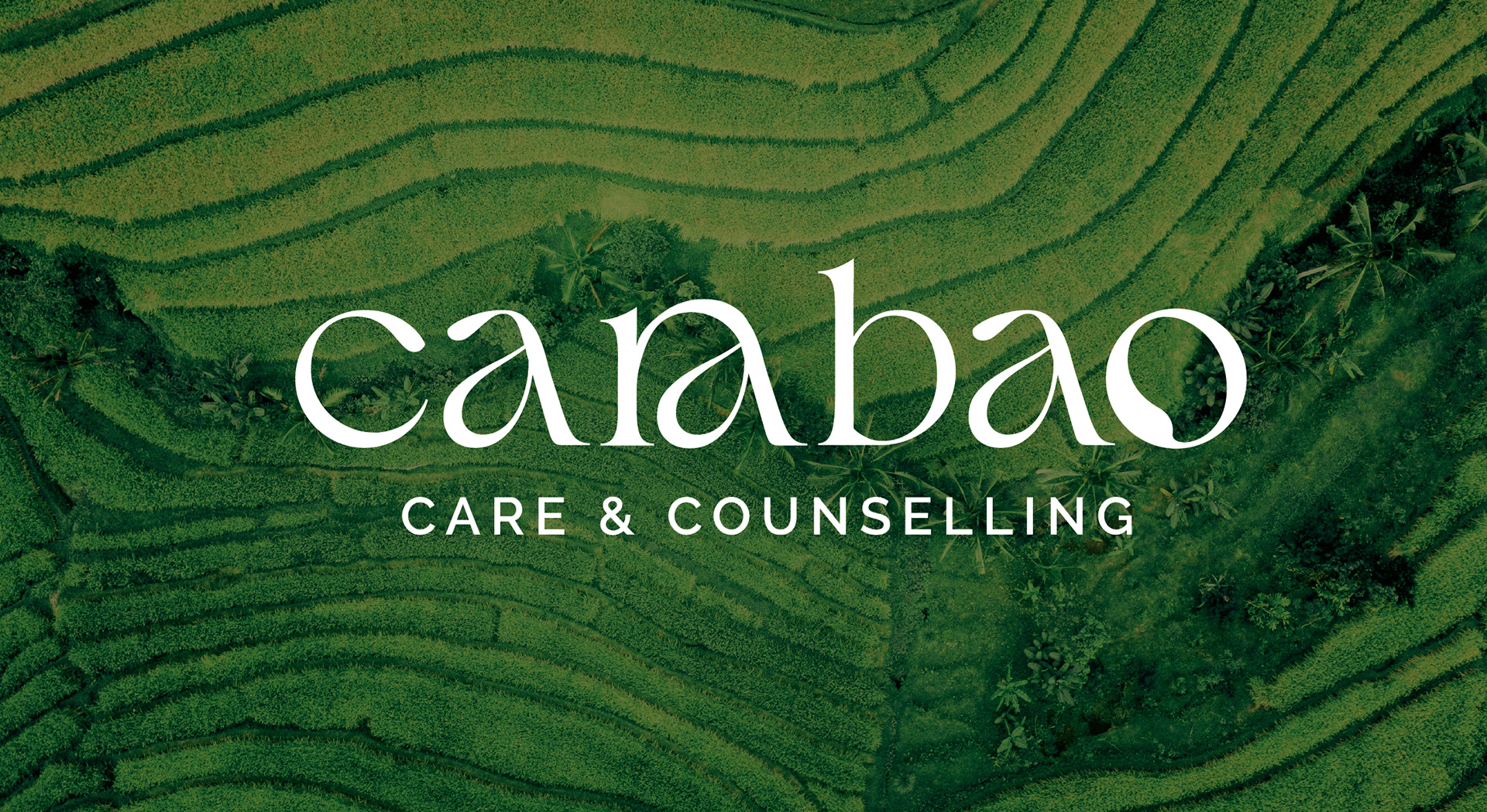
The concept behind the brand was deeply rooted in the founders' Filipino heritage. We chose the carabao,the national water buffalo of the Philippines, as the central symbol. Much like the founders and the Filipino community as a whole, the carabao represents resilience, strength, loyalty, hard work, and perseverance.
The logo features two carabaos, with the tail of one subtly embracing the other. This detail serves as a visual nod to the sisterhood at the heart of the organization and the partnership that brought the brand to life.
If you look closely at the "O" in Carabao, you'll notice the silhouette of a mango carved into the letterform. This small but meaningful detail references Mango Mental Health, the first clinic established by the founders and now a sister company within the Carabao Mental Health family.
What a pleasure this project has been to work on.
.
.